Area of investigation
Area of investigation
Magazine design Neville Brody Research
Neville Brody is one of the best-known graphic designers of his generation. He studied graphic design at the London School of Printing and rose to prominence in the early 1980s through his album cover designs and involvement in the UK indie music scene.
Neville Brody was born in London and studied design in the UK in the 1970s. He studied for three years at the London School of Printing, where his rather experimental work received little positive criticism, as schools typically taught traditional printing methods. He gained a lot of attention as the art director of The Face magazine from 1980 to 1993. The magazine was hugely popular in the 1980s, known as the "fashion bible" and set many of the design trends that were successful during the same period
Typographic rules for magazine design
- Entry points
- Paragraphs indented or space (but not first)
Paragraph spaces/identifiers should not be used in the first paragraph. Paragraph spacing is used to place paragraphs for ease of reading by the reader.
- Line length
- Alignment
Alignment is essential in paragraph styles, you can be creative, but it is important to follow some rules, such as: B. Use justifications to avoid creating river-like gaps between lines. Another rule is to choose a left or right line where the lines end symmetrically.
- Typefaces
Using two different typefaces in the same paragraph can be used to distinguish between different themes of the magazine and is useful because it makes it easier for readers to understand.
- Caps
CAPITAL letters can be a good thing for titles or headlines, but authors should avoid using them in longer blocks of text, as it can confuse readers.
Magazine design analysis
Semiotics & intertextuality

What is a digital image? What different
kinds of digital images are there?
What do we mean by resolution?
• What image file types are most suited to
websites?
• What are the differences between them?
Jpeg: Are used for photographs and images where there is a continuous tone. Lighter and darker areas vary gradually. it does not support text or sharp edges.
Png: Png is file format that's based on lossless compression. PNG is designed to work in online streamed viewed
Gif: Gif format is best used for text, line drawing, screenshots, cartoons and animations.
SVG: SVG is created for web. SVG works well with graduated colors. SVG is also scriptable and versatile.
Tiff:
BMP


Lighting styles


 These are the links for my app


https://superuser.com/questions/53600/jpeg-vs-png-vs-bmp-vs-gif-vs-svg
Color systems

Podcast analysis
- Explain the Podcasts Aims (informational, entertainment)
- Discuss the Podcast’s Context (How many episodes? How is it distributed?)
- Compositions (What are its formal aspects? Transitions? Theme music?)
- Content (What does it contain? Subject matter? Interviews? Guests? Anecdotes? Stories? News report?)
- Response: Critique? Did you enjoy? Why? What's good?
Html & CSS

This is my first attempt at Html & CSS. I decided to put the Hello world under the Santa picture so there will be less negative space.

I decided to change the position of the Hello world to above the Santa picture. I choose the color blue violet because it's unique and I like it.
In the beginning, this was a bit hard because I had to understand the coding and how to set it up but I manage to create it in the future I am looking for more tasks like this so I will learn more about it.
Indesign practice
This is my InDesign experience. I tried out inDesign and created a magazine about Liseberg the amusement park in Sweden. I choose Liseberg because I like the logo and it's very bright and colorful. The hardest thing about InDesign was the measurement and where to put the page number but I managed to do it. I used a pentagon for the image because the image was a bit big.
I put a heading on page 3, I should've put a heading on page 2 as well but I learned from it. I made the heading big with thick letters. The type is sanserif. I used the famous Liseberg quote for the heading which is The price is what you pay, value is what.

Website best practice & analysis
There are many ways to create a website and there are thousands of designs and strategies to use but there is some important information that a website creator should think about.
There are 9 principles of good web design. For every website, you need a purpose The website should always please the needs of the users. A good website is a simple website. You need simplicity because it makes information clear and understandable. You also need no navigate your website to make it simple to understand. your website should be clear for adults and kids. F-shaped pattern reading is a great way to set up your website, Eyetracking research shows that people scan web pages and phone screens in various patterns, one of them being the shape of the letter F.
Hierarchy is the most important thing seen first and that shows the importance in order from highest to lowest. It could be price, quality, or most purchased. The content is also very important. Having good content is very important because content makes the whole website.
Not having a lot of content makes the website load quicker and that is important because you don't want to wait for ages for a website to load.
And last but definitely not least is to have the website mobile friendly. Many websites today are getting visited by phone and not all people have computers or laptops so making the website mobile-friendly is very important and also makes the website suitable for mobile. everything should be clear like on the computer.
1. WEBSITE PURPOSE.
2. SIMPLICITY.
3. NAVIGATION.
4. F-SHAPED PATTERN READING.
5. VISUAL HIERARCHY.
6. CONTENT.
7. GRID BASED LAYOUT.
8. LOAD TIME.
9. MOBILE FRIENDLY
Analyze website (Cornerstone)

Creating app mind map

Semiotics and intertextuality
Semiotics - Semiotics is the study of symbols and their meaning in society. A logo is something that can represent something else - in other words, a logo is anything that can convey meaning. Can use symbols, words, and technical elements to construct meaning
Symbolic signs - is the main thing in the picture and how people see the picture and describe it for example if you see a picture of a chef you will talk about kitchen clothes
Lighting styles
Split lighting - is when the light is placed 90 degrees to the person's face. The result will be that half of the person's face will be lit up and the other half will be a dark shadow. This is a dramatic portrait, the shadow line will be vertical on the person's face

Rembrandt lighting - Position your subject just over 90 degrees from the light source. Your light source will also be slightly at the same height as your subject's head. One side of the face is still in shadow, but the triangular light should fall on the cheek, no wider than the eyes and no longer than the nose This light-cast shade makes round faces appear slimmer. This lighting technique is named after the painter Rembrandt because he used this type of light in many of his subjects

Loop lighting - Loop lighting is a lighting mode that creates a circular shadow on the subject's face under the nose. You can do this by positioning your key light at a 30-45-degree angle to the side of your subject and elevating it above eye level. The round or "ring" shape under the nose is on the opposite side of where you placed the light. It is also characterized by longer shadows on the chin and under the chin due to the downward slant of the light.

Butterfly lighting - Butterfly lighting is a portrait lighting pattern where the key light is placed above and directly centered on a subject's face. This creates a shadow under the nose that resembles a butterfly. It's also known as 'Paramount Lighting,' named for classic Hollywood glamour photography.

XD app practice


Stopmotion ideas mood board

Language app recording
App evaluation (Helloworld)
1. What was your app for and what were the reasons behind your choices?
Why did you choose that app? What does it allow your audience to do? Who were you
targeting with your app?
My app is for education purposes, for people that have trouble learning a language of a country they live in, or for people that are just interested in learning a new language. I choose this kind of app because when I came to the UK 2 years ago I had trouble in college because I did not understand a lot of things so which made me fall behind but after hard work and dedication I managed to learn a lot of English. That inspired me to create an app that could help people in situations similar to mine.
In my app, my audience has access to a variety of languages where they have simple but important words and phrases that will be useful while learning a language you can use my app offline and you can have access to more than 8 languages for example Arabic, Swedish, mandarin and many more. The target audience for my app is people that have moved to another country or people that travel often and spend time in different countries. it could be from the age of 18-30.
2. How has your research helped you develop your final project?
Which aspects of apps you analysed have you used? How has your design been
influenced by researching UX and UI? What other research did you need to do to create
the app?
My research helped me a lot with my app. My research helped me find different designs and logos for my app. I learned that the app should be colorful and smooth for the eyes so it will catch the audience's attention and for young people to be interested. My research helped me create the logo for my app, I got inspired by another logo, the logo had a globe so I included a globe to my logo.
3. How has your planning helped you develop your final project?
Did you create a plan? Did you follow it or adapt it?
My plan was to create a unique app that all types of people will be interested in and understand. I would say I followed almost my whole plan I just missed one part. I planned to have a colorful and interesting app. I also planned to use many languages and I chose a few of the most spoken languages in the world for example Arabic and Mandarin. There is also English for people that Want to learn more English.
I planned for my app to be offline so u can use it anywhere and everywhere so you don't need to worry about wifi. The plan for the app was for it to be suitable for moving people, travelers, and people that are interested to learn another language. The part that I did not follow was the quiz, My plan was to add quizzes for every language but I did not have the time for that.
4. What have you learned about media technologies from the process of constructing this
app?
What software did you use? How difficult/easy was it to use? What problems did you
encounter? How have your skills developed across this project?
I planned for my app to be offline so u can use it anywhere and everywhere so you don't need to worry about wifi. The plan for the app was for it to be suitable for moving people, travelers, and people that are interested to learn another language. The part that I did not follow was the quiz, My plan was to add quizzes for every language but I did not have the time for that.
For my app, I used Adobe XD. This was my first time using XD and I really liked it. XD is very easy to use for beginners. It's easy to understand and the quality is good. I had no trouble at all using XD. I've now learned how to create an app on Xd and in my free time I created my own app to get some more experience just in case we use it in the.
5. How will your app attract your audience?
What specific techniques did you use to target/attract your audience? How did you
select content to appeal to your audience? How did you use design to attract your
audience? Did you seek feedback? What do they think of your app? Did you improve it
following feedback?
Consider colour, type, legibility, images, buttons, navigation, feedback, language
My plan was to create a unique app that all types of people will be interested in and understand. My app is very colorful and has a lot of information so that is eye-catching. The most important thing and what I think really attract the audience is how simple it is to use it. Whenever you want to learn a language you simply tap on the flag and the language and the translation will be available.
To make it easier and more appealing to my audience I used Flags to identify the language. Some people will get confused about the language so the flag is a great guide. So
6. How closely did your final app resemble your initial ideas and expectations?
Does your product match up to your initial idea? What do you think works well? How
might you improve your product if you had more time?
I planned for my app to be offline so u can use it anywhere and everywhere so you don't need to worry about wifi. The plan for the app was for it to be suitable for moving people, travelers, and people that are interested to learn another language. The part that I did not follow was the quiz, My plan was to add quizzes for every language but I did not have the time for that.

Magazine Progress (InDesign)


Final magazine cover & spread


pull quotes
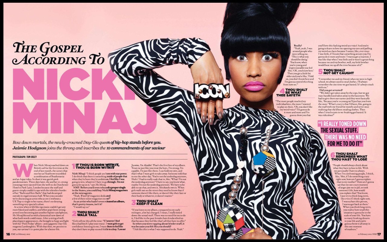
Magazine analysis (Nicki Minaj)
Magazine planning

Kommentarer
Skicka en kommentar